In a world brimming with data, the ability to convey complex information quickly and effectively is not just an advantage — it’s a necessity. Infographics bridge the gap between data complexity and audience understanding, providing a visual medium that’s both attractive and informative. With the rise of Clip, a command-line illustration processor, crafting these intricate visual narratives has become more accessible. Clip offers an open-source solution for those seeking to represent data graphically without a steep learning curve.
Understanding Infographics and Their Importance
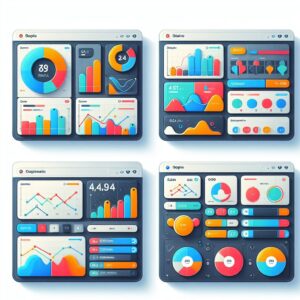
Infographics have emerged as a crucial medium in the visual communication landscape, transcending mere aesthetic appeal to become potent vehicles for conveying complex data. Infographics curate and condense information into an easily digestible format, employing compelling graphics to narrate a tale that resonates with the audience swiftly and effectively. By tapping into our innate proclivity for visual processing, infographics enable the quick assimilation of insights and relationships that might otherwise be lost in translation within columns of figures or verbose reports.
The power of infographics lies in their versatility and reach. On social media platforms, where attention spans are limited and content is consumed at breakneck speed, infographics cut through the noise. They enable marketers, activists, and businesses to share their messages with visual impact, often sparking engagement in the form of likes, shares, and comments. The visual nature of infographics allows them to be cross-cultural and cross-language, which increases their potential reach immensely.
In the world of report and presentation development, infographics serve an equally vital role. They condense pages of research and analysis into bite-sized visual morsels that can tell a cohesive story at a glance. This aspect is invaluable in executive summaries and stakeholder reports where time is precious and the essence of the findings must be conveyed succinctly and memorably.
As educational tools, infographics have found a special niche. They bridge the gap between pedagogical content and learner engagement, serving as visual summaries that can encapsulate lessons, visual cues for memory retention, and quick references that students can revisit. The merger of text, image, and data in infographics caters to various learning styles, making them all the more effective as teaching aids.
In industries where data reporting is regular and comprehensive, such as finance, healthcare, or sales, infographics offer a method to regularly update stakeholders without the need for in-depth analysis by the recipient. For example a well-designed infographic can highlight trends in financial markets or summarize patient statistics for healthcare providers quickly and accurately, allowing for rapid assessment and informed decision-making.
Beyond their function as efficient communicators, infographics invite a creative approach to problem-solving. They challenge storytellers to find the most striking and suitable visual metaphor for each data set, leading to inventive combinations of design elements that both inform and inspire.
Setting Up Clip for Infographic Design
Before diving into infographic creation with Clip, ensure you have the environment set up. Install Clip on your system and familiarize yourself with the basic commands. Since Clip operates on the command line, some familiarity with terminal commands and the fundamentals of graphic design will be beneficial.
Data Selection and Structuring for Infographics
Selecting and structuring data involves a strategic approach that begins with identifying the core message or story you wish to tell through your infographic. It’s essential to choose datasets that are directly relevant to your topic and that will resonate with your target audience. Relevancy ensures that your viewers find the infographic informative and engaging, which is particularly important in today’s information-saturated environment.
Once you’ve determined the key focus of your infographic, gather the most current datasets available. Using outdated or obsolete data can misinform your audience and damage the credibility of your content. When possible, reference the original sources of your data to ensure its reliability and accuracy. Transparent sourcing adds a layer of trust and can be an essential element of the infographic itself, allowing viewers to verify and explore the data further if they choose.
The actual structuring of the selected data is where technical precision comes into play. In preparation for Clip, datasets should be structured in a clear and orderly fashion, often in tabular formats that Clip can interpret, such as CSV or JSON files. This means organizing your data into rows and columns with consistent labelling that Clip can reference. For example, if your infographic requires a timeline, ensure that dates are formatted uniformly, or if you need to illustrate proportions, verify that percentages add up correctly and are represented consistently.
Sorting your data logically aids in a more intuitive design process. Organizing datasets from highest to lowest, grouping similar categories, or segmenting data by recognizable criteria can greatly improve the clarity of subsequent visualizations. For example, structuring sales data by regions, and then within those regions by individual products, can facilitate a multi-layered approach to visualization that naturally leads viewers through the data in a guided and coherent manner.
Before importing your structured data into Clip, try to anticipate the types of visualizations you’ll need. This foresight allows you to tailor your data formatting specifically to those visualization requirements. For example if you plan to use a pie chart, you may need a structure that pairs categories with their corresponding values. If you’ll be creating a stacked bar chart, your data should be segmented to reflect the sum components of each bar segment.
Cleaning and sanitizing your datasets is crucial. Scrutinize your data for inconsistencies, errors, or missing values that could skew your visuals or mislead viewers. This pre-import refinement ensures that once your data is ingested into Clip, the graphical representations created will be as accurate and informative as the data they’re based on.
Selection and structuring are the preparatory steps that can determine the effectiveness of the entire visualization endeavor. When done with careful consideration, they pave the way for a seamless and error-free integration into Clip, allowing you to focus on the creative process of infographic design with confidence in the integrity of your underlying data.
Planning Your Infographic Layout with Clip
When it comes to planning the layout of your infographic using Clip, a clear strategy is key to ensure that the final product is both visually engaging and informative. The arrangement of elements within your infographic should guide the viewer through the information smoothly, emphasizing the most important points and supporting the overarching narrative. Given Clip’s strengths in rendering crisp charts and geometric shapes, the layout should leverage these capabilities to make the data stand out.
Start by defining the story you wish to tell with your infographic. What is the main objective, and what key messages do you need to convey? Once you have a narrative in place, you can begin to map out the visual journey. A common approach is to start with an attention-grabbing header that includes the title and a brief introduction or summary that sets the stage for the data to follow.
With the narrative as your blueprint, consider how Clip’s output — namely, its range of data visualizations — can best represent each data point. Clip is adept at generating various charts, such as line, bar, and pie charts, that can illustrate trends, comparisons, and proportions effectively. Identify the most appropriate chart types for your data and begin to outline where they’ll be placed within your infographic.
As you visualize each segment of the narrative, focus on the flow and transition between sections. Think about the viewer’s eye movement as they take in the infographic — ideally, you want to create a path that leads from one element to the next in a logical and intuitive way. Use Clip’s ability to draw basic shapes to create connecting lines or arrows, or to section off different areas of your infographic for varied content like statistics, quotes, or additional graphics.
The visual hierarchy is another key component of your layout plan. Determine which pieces of information are of primary, secondary, and tertiary importance. This hierarchy influences the size and prominence of each component within the infographic. For instance, primary data might be represented by a large, colorful chart, while a secondary point could be illustrated with a smaller graph or icon, and supporting details might be included as text annotations.
Balance and white space play a vital role in infographic design. Even though Clip can produce a multitude of graphical elements, it’s important to avoid clutter. Ensure that each element has enough space to breathe, and avoid overwhelming the viewer with too much information at once. Utilize white space to create separation between different parts of the infographic, enhancing readability and overall aesthetic appeal.
Consider any branding or design guidelines that need to be integrated into the infographic’s layout. Color schemes, fonts, and logo placement should all be thought about from the planning stage to ensure a cohesive look that aligns with the brand or intended style of the piece.
Planning your infographic’s layout is an exercise in organizing content in a manner that not only looks appealing but also aids in the comprehension of the data. By meticulously planning the structure of your infographic around the types of visualizations that Clip excels in creating, you can craft a layout that smoothly guides viewers through your narrative, delivers insights effectively, and makes a lasting impact.