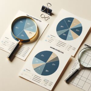
Pie charts are ideal for showcasing parts of a whole – they visually break down what percentages of a total each category represents. They work best when you’ve got a limited number of categories (usually around 2 to 6) and when you’re aiming to give a quick snapshot of how these categories compare proportionally to each other.
Best Practices for Pie Chart Creation with Clip
A pie chart’s strength lies in its ability to communicate parts of a whole in an instantly comprehensible manner. It is advisable to limit the number of categories represented in a single chart. A pie chart should contain no more than six segments to prevent visual clutter and confusion. Clip’s functionality supports this by allowing users to focus on highlighting the most critical data points without overwhelming the audience.
Selecting contrasting colors for adjacent segments significantly improves the chart’s readability. Contrast should not give way to visual discord. Colors should be chosen to maintain a harmonious overall look. Clip provides users with the capability to customize colors meticulously, ensuring that each segment is distinct yet part of a cohesive whole.
 Labels should be concise, providing just enough information to contextualize each segment without overcrowding the chart. Positioning labels smartly to ensure they are legible without detracting from the chart’s visual appeal is necessary. Clip may require manual input to add labels, pushing users to think carefully about the placement and content of these textual elements.
Given that the primary goal of a pie chart is to convey the proportionate values of different categories, using percentages instead of absolute numbers for labels is a best practice. Percentages immediately communicate the relative size of each category to the whole, facilitating a quicker and clearer understanding. Clip’s data input flexibility supports this approach, enabling users to focus on presenting percentage-based data efficiently.
A logical ordering, such as arranging segments by size starting from the largest in a clockwise direction, mirrors natural reading patterns and enhances comprehension. This method allows viewers to quickly grasp the relative significance of each category at a glance. Through precise command-line instructions, Clip users can control the order of segments to achieve this effect.
Viewing the generated chart on different devices and screens is an important step to ensure that it remains effective and visually consistent across various platforms. User feedback and iterative design adjustments play a key role in improving the diagram. Clip’s versatility as a tool allows for easy modifications and experimentation, encouraging users to continuously improve their visualizations.
Common Pitfalls to Avoid
One of the biggest pitfalls when creating pie charts is the tendency to include too much information in one chart. While it may seem beneficial to provide a comprehensive view of the data at hand, overcrowding a pie chart with too many segments or categories can lead to a loss of clarity and readability. The primary advantage of a pie chart is its ability to convey parts of a whole at a glance. When a chart is overloaded, it complicates the viewer’s ability to quickly grasp the presented data. Limiting the number of segments to a manageable few ensures that each part is distinctly recognizable and the chart remains effective.
Choosing colors that are too similar for adjacent segments is another common mistake. While maintaining a harmonious color scheme is important, adjacent segments in the pie chart should be easily distinguishable from one another. Failure to do so can confuse, making it difficult for the viewer to differentiate between categories. This does not mean one should resort to using overly bright or clashing colors. The key is to balance contrast with aesthetic appeal, ensuring that each segment stands out clearly while the chart as a whole remains visually pleasing.
Neglecting the order in which segments are arranged can significantly detract from the effectiveness of a pie chart. A random or non-intuitive arrangement of segments can make the chart harder to read and interpret. It is generally advisable to organize segments in a logical manner, such as by size, in a clockwise direction. This aids in better comprehension of the chart by aligning with natural reading patterns. By meticulously controlling the order of segments when using Clip, creators can avoid this pitfall and enhance the viewer’s understanding of the data.
Crafting Your First Pie Chart with Clip
It is important to have Clip properly installed on your computer. The installation process involves downloading the software from its official repository and following the provided instructions to set it up on your system. Ensure that Clip is fully operational by running a basic command, such as displaying the version number, to confirm that the installation was successful.
Begin by organizing your data, ideally limiting it to a few key segments to maintain the chart’s readability. Each segment will represent a slice of the pie, with the size proportional to its value. Prepare your data in a simple format that Clip can process, noting the values and labels for each segment.
The next step is to construct the command that will generate your pie chart. Clip commands are structured to specify various parameters of the chart, such as the dimensions, colors, and labels of the segments. Familiarize yourself with the syntax used by Clip to define these elements. A basic command will include information on how to visually distribute your data into slices, apply colors, and add labels that make the chart informative and engaging. It’s beneficial to refer to Clip’s documentation to understand the options available for customization.
After crafting the command, execute it in your command-line interface. Clip will process the input and generate the pie chart based on the parameters specified. It is necessary to review the chart carefully, examining it for accuracy and visual appeal. Check that the segments are correctly proportioned, the colors are distinct and harmonious, and the labels are clear and positioned appropriately. This review stage is an opportunity to make adjustments to better convey the intended message.
Based on your review, you may find aspects of the chart that could be improved, whether it’s tweaking the colors for better contrast or adjusting labels for greater clarity. Return to the command you crafted and make the necessary modifications. This iterative process allows you to refine the chart, enhancing its effectiveness as a tool for data visualization.